Hey everyone! Today I thought I’d discuss a bit about the player boards in Dagers High, and some of the iterations it has been through. The player board has probably been through over 30 iterations, and it is in my opinion the most important part of the game because of how much information is stored on it. Since it is the first thing a player sees, it was important to get the board right visually as well, and so a lot of effort was put into the design. Some of the major things I looked out for were:
- Simplicity
- Theme
- Mechanically easy to use
1 and 2 are pretty straight forward. I think that simplicity is always good in game design because if it looks too complicated people quickly lose interest- even if the game is mechanically simple. Theme is something that helps absorb players into the game environment, and it is also a very important quality. Finally, mechanically the board has to be easy to use. In a lot of our earlier versions, sliders kept being misplaced because the board was too crowded. It is important that the pieces actually fit on the board and are easy to move around.
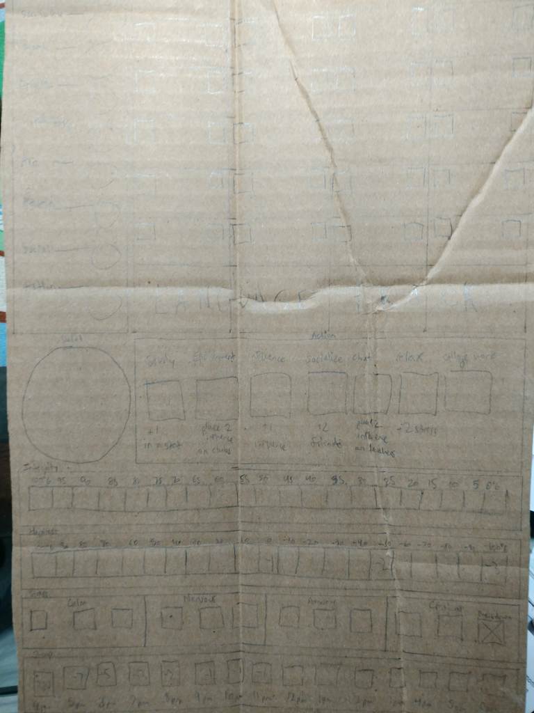
In the beginning, the main idea was to have the player board mimic a resume or a transcript, which is why we initially wanted it to be vertical. However, especially on small tables, this became a problem since placing a teacher board in addition to cards in the middle of the table was difficult. This made us think about ways to make the player board horizontal instead- which most other board games like Agricola or Eclipse do likely for the same reason.
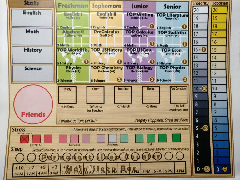
In this iteration, there are also many more classes, which were cut due to being too complicated and unnecessary. There is also an additional stat- Athletics stat. While this was great theme-wise, it also didn’t really do anything for the game because gym wasn’t really that important of a class (it didn’t even have a dedicated teacher!). Cutting out this row helped a lot with making the game look and feel cleaner, even if that meant that the board looked slightly less like an actual high school schedule. One other major mechanical difference in this iteration is that players did not spend their stats to correct classes- which is why the requirements in the later years are much higher than now. We mainly decided to change this to keep the cube-clutter low.
Our next major iteration is much closer to our current player board, but it still feels crowded and complicated. It uses the sleep cube mechanism which is the topic for another post, but essentially when we switched to card-based action points all of our play testers said that they preferred it, which is pretty good evidence to change things :)! One thing I like about this iteration a lot is that Integrity and Happiness are now on the right side of the player board instead of on the bottom- this differentiates them so that they stand out. In addition, it makes it feel like Integrity and Happiness are falling, so it thematically fits.
The current player board looks like this:
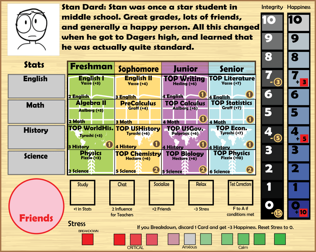
A lot has changed, but overall I was happy with how the player board evolved. I think it is a lot cleaner than before and captures a lot of what I set out to accomplish. Let me know what you think in the comments below! Also, don’t forget to subscribe by using the subscribe widget on the right- I finally figured out how to do that!